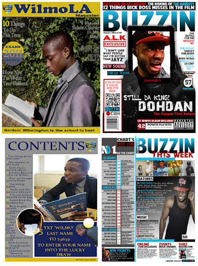
Looking back at your preliminary task (the school magazine task), what do you feel you have learnt in the progression from it to full product?
Suprisely I felt the preliminary task of constructing a school magazine, benefited my well in making my music magazine. The preliminary task has taught me a variety of skillful and benefical techniques, it has also introduced me to a variety of softwares such as Photoshop and InDesign which taught me how to manipulate images and use different tools to put together my music magazine.
 If I was to compare my music magazine to my preliminary task, you could clearly that my school magazine lack greatly in professionalism and creativity which I believe my music magazine has. It looks very simple and of a low standard. Although before creating my preliminary task I had the basic understanding of what not to and to include into my school magazine but I seem to not full understand.
- Comparison between front covers
Straightaway when you compare both covers you can see which one could easily sit on the shelf and which one looked like an 'Einstein at Microsoft Word' made it in a Microsoft Word document. There is a lot of space on my school magazine - it has few cover lines and the font along with the colour contrast greatly with the background. Additionally the music magazine looks more vibrant that the school magazine, this could be due to me trying to incorpret the colours from the school bag into my magazine. Although since going back and reviewing over the preliminary task I have found that it is possible to use the same colours (blue, yellow and grey) in a more vibrant way.
- Comparison between content pages
From my research in print production, magazines usually have a three column structure in their content page which ensure them that they are using up as tmuch space as possible at the same time, stopping it looking cluttered as it has a structure. Nonetheless I discovered that leaving a lot of space in your magazine in can cost a lot of money moreover comparing the two content pages I can see that my school magazine not only lacks a lot of professionalism but has a lot of space which may cost a lot in print production.
Furthermore looking back at my preliminary task I feel my knowledge of using Photoshop has expanded. I have learnt where each tool is, how to find it etc. I have also found a webiste filled with over a hundred of fonts (dafonts.com) - this expands my variety of fonts allowing to experiment with more. The most important thing I have learnt is how to make my work look professional and useful techniques in my magazine that I could increase my consumers.
Overall since the preliminary task the complexity of my layout has increased, my kmowledge about softwares have improved throughout the project.
If I was to compare my music magazine to my preliminary task, you could clearly that my school magazine lack greatly in professionalism and creativity which I believe my music magazine has. It looks very simple and of a low standard. Although before creating my preliminary task I had the basic understanding of what not to and to include into my school magazine but I seem to not full understand.
- Comparison between front covers
Straightaway when you compare both covers you can see which one could easily sit on the shelf and which one looked like an 'Einstein at Microsoft Word' made it in a Microsoft Word document. There is a lot of space on my school magazine - it has few cover lines and the font along with the colour contrast greatly with the background. Additionally the music magazine looks more vibrant that the school magazine, this could be due to me trying to incorpret the colours from the school bag into my magazine. Although since going back and reviewing over the preliminary task I have found that it is possible to use the same colours (blue, yellow and grey) in a more vibrant way.
- Comparison between content pages
From my research in print production, magazines usually have a three column structure in their content page which ensure them that they are using up as tmuch space as possible at the same time, stopping it looking cluttered as it has a structure. Nonetheless I discovered that leaving a lot of space in your magazine in can cost a lot of money moreover comparing the two content pages I can see that my school magazine not only lacks a lot of professionalism but has a lot of space which may cost a lot in print production.
Furthermore looking back at my preliminary task I feel my knowledge of using Photoshop has expanded. I have learnt where each tool is, how to find it etc. I have also found a webiste filled with over a hundred of fonts (dafonts.com) - this expands my variety of fonts allowing to experiment with more. The most important thing I have learnt is how to make my work look professional and useful techniques in my magazine that I could increase my consumers.
Overall since the preliminary task the complexity of my layout has increased, my kmowledge about softwares have improved throughout the project.
In making my magazine I realised that with model I would not only have to think about their look but the financial cost of this model, therefore the type of model I use is extremely important when it comes to making my magazine. Due to the genre of my magazine I need a model that would the fit the urban, R'n'B and Rap look. Moreover I made sure my models were at least 17 and above avoiding any chances of my rapper looking too young. However through researching I found that males in particular tend to look younger than their actual age, this is sometimes as a result of constantly exercising or sport which majority of men do. Nonetheless I contemplated about whether I just use women. Next I cancelled out the people who I felt at first would be unreliable enough to take on the photoshoot - e.g university exams, AS/A2 exams. Then cut down my models to who I felt did not have a mature enough face to give my magazine a realistic look. I then chose the model which I felt was the most versatile to use on my frontpages. This left me with eleven models.
Out of the eleven models I need the one perfect person that would really make my magazine stand out if put on the shelf. In order to help me with my decision took sample pictures of all the models I felt could potentially be on my front cover.
Through a lot of deliberating I choose my model Daniel to represent my first issue, and as mentioned before is 21 years old, 5ft 10 and a size 8 in clothing - a comfortable age, weight and length of a person for me to work with. Also I believe due to the expenses of university, he was forced to carry the rugged look as its was cheaper for him than constantly cutting your hair, this worked perfectly well for me as I thought he fitted the stereotypical rapper's image perfectly.
Due to my interview being so long I had to extend my double page spread to another double page spread. As mentioned previously on my blog I decided to not follow the usually trends of magazine that if the interview is too long it will extend to another A4 page rather double page spread like mine did. Nonetheless I repeated majority of the skills/techniques I used on my first double page spread with my second, like keeping the settings the same (orientation - horizontal, and creating six columns).
 Just like the first double page spread, I started with my background. Similar to first image it was not long enough so I had to extend it. Using the selection tool, selecting the end section of my image and duplicating it until it was long enough for background.
 I first started will off with my quote at the top my article 'THE HIGHER YOU GET THE MORE YOUR FRIENDS BECOME FAKE' - I choose this quote because I believed it stood out the most in my interview and it would definitely draw in the attention of readers, I used the font Impact Label and colour black. Next I went on to create three of the boxes using the vector tool where I will place my remaining interview into, I made the outer rectangular burgundy and the inner rectangular white, this ensures my reader will be able to read my interview clearly as the colour was black and the font was Arial. To highlight the continuation of my article onto the second double page spread I made sure the font and the colour of the font remains the same. I then copied the interview into the last three columns of the six.

As a bonus feature for my readers I added one of his tracks (wrote down the lyrics that stands out and a small review on what it sounds like. I added all this information into a rectangular vector that I made with the vector tool. I then created another rectangular box which I edited in Photoshop. In Photoshop I changed the colour of the vector to burgundy and then changed the shape using the selection (I continued to cut off each section till it formed a triangle, once again InDesign automatically changed the form of vector through the integration between the two programmes. Due to the clever techniques of InDesign I was able to take off the peak of the triangle, by using clicking on the vector and used the blue line (not the brown line because it would cut the image) to hide the 'pointy' section of the triangle. Using the font American Purpose and the colour white I created the words 'NEW DOHDAN TRACKS'. Under those words I made the words 'THE LOWDOWN' which is in the same font but in the colour black. Feeling in an artistic mood I once again made a vector and edited it in Photoshop, in Photoshop I duplicated the layer till I felt it was long enough, I then flattened the layers which made the vector turn into an image in InDesign. Next I made the words 'HERE"S A TEASER OF WHAT"S TO COME...' in the font Arial and colour white. Finally I used the vector tool and created a skinny long baby blue rectangular box to differentiate between the title of the song and the reviews.
I made 'IM DA KING...SOUND LIKE...STAND OUT LYRICS' all the same font which was America Pupose. The rest of the words I made the font Arial and the colour actual little. Finishing off the article I created the page numbers at the bottom of the page with the exact same format as the first double page spread.
To construct my double page spread I used 'In Design'. Using 'In Design' I realised that the programme gives more contact sheet that 'Photoshop' and its results are more neater, orderly - it easily allows me to change the font and layout of my article. I first set up my double page spread by changing the orientation to horizontal and adding six columns (this is the average length and width of double page spread articles).
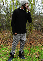
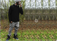 Through my researching of double page spreads, I found the articles which used their image as a background more appealing. However the image which I choose for my double page spread was not long enough moreover through the integration of Photoshop with InDesign, I was able to alter the length of my image. This was done by manipulating the image - using the selection tool I selected the end of the image copied it then pasted it on a new layer. I did this ten times till it looked like this (left side). I then used the blur tool to eliminate the obvious additions of the copied layers. Automatically the new change to image was shown in InDesign. Next I created the box I placed my article, (I made this directly into InDesign rather than Photoshop) using a vector tool and created two rectangular boxes. I made the outer vector baby blue and the inner vector white. Once I had finished making the box for my article, I began on the title of my article - 'EXCLUSIVE IM DA KING'. In making 'EXCLUSIVE IM DA KING' I used the font 'Hollavetica, making 'EXCLUSIVE' the same burgundy that I used on my front cover (to show the consistence of my house style) and made 'IM DA KING' black to contrast with the colour od 'EXCLUSIVE' (making them both stand out). I then added a controversial question 'FOR HOW LONG?' this highlights my artist 'cockiness' as he attempts to answer this question throughout the interview - I made the colour baby blue but changed the font to 'Chewy'.
 Next I added my description of my artist DohDan using the font Arial Bold to either reintroduce or introduce him to my readers. I then copied my article from Microsoft Word into InDesign, into the last two columns of the six that I had created. This automatically gives my article a neat, professional look, I also made the questions burgundy and bold while the answers are in black to differentiate between the two, although I used the same font to not only show consistence but once again professionalism and neatness.
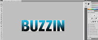
I then used the vector tool and created another rectangular shape near the top of my page. Inside that vector I placed 'B EXCLUSIVE INTERVIEW' - in making these words I used a unique selling point that several successful magazines use, which is turning the name of the magazine into a logo. As mentioned on my blog previous turning the name of a magazine into a logo could make the magazine easier to recognise, nonetheless just the letter 'B' was an idea inspired by Q magazine which signature Q is well-known. Therefore in order to make my magazine well interconnected with readers and professional I used the first letter of the title of my magazine to represent the name 'BUZZIN'. This was simply done by copying the layer 'BUZZIN' into a new document, next I used the section tool (not the crop tool because it would reduce the entire image to the size of what is selected instead of cutting the selected section and leaving the remains of the image) and just like my background image extended the 'B'. The rest of the words (EXCLUSIVE INTERVIEW) I used the colour burgundy and font Arial.


 To add the finishing touches to my magazine I added my page number to the left side of my magazine - using the vector tool creating a square then placed the number 25 (same as mentioned on content page) which was the colour baby blue and font American Purpose. On the bottom right I used the vector tool and created a rectangular tool, inside that rectangular tool I placed the page number, the name of my magazine (BUZZIN), date and the website of my magazine.
What have you learnt about technologies from the process of constructing this product
 Throughout the construction of my magazine I have used various technologies which allowed me to be as creative as I wanted to be, technologies such as 'Photoshop' to create my front and content page. Photoshop is a great digital image editing application. I was taught how to use the powerful tools to enhance and edit my pictures - tools such as 'magic wand' which allowed me to not only extract my model from the background but select certain parts of the image which I wanted to alter without changing the whole image. Another great tool which I found on Photoshop was the 'transform tool' this tool I found of great use as I was able to enlarge my image without over stretching the pixels in my image at the same time making my image look neat and proportional. Without Photoshop I would not have been able to edit the images that I imported into 'InDesign' for my double page spread.
 In constructing my double page spread I used both 'InDesign' and 'Photoshop' together as mentioned before to edit my images I need to use Photoshop, as InDesign did not allow me to add effects which Photoshop did. For example the 'magic wand' to select a section of my image and change the colour. Additionally in using InDesign I used the programme Microsoft Word to type up my article. What I enjoyed and learnt about Microsoft Word is that unlike Photoshop and InDesign; Microsoft Word correct both your grammar and spelling automatically which kept me 100% sure that I would have no grammatical mistakes and my readers would be able to understand my article.
(To see more on how I used InDesign and Photoshop, please see Construction)
 Another useful piece of technology that I used was an online website - Blogger, this allowed me to be organised as possible. Blogger is equipped with many tools that keep archive of my work,'labels' which allows readers to easily navigate around my blog along with dates and time of each post which helps to me to reflect on whether I am using my time correctly and what I would need to change.
 Furthermore another important piece of technology that I used was the camera in taking my images. In order for my images to come out clear and vibrant I would need a camera with a large amount of megapixels, moreover I invested in my dear friends Canon 600D camera which has 18 megapixels. As mentioned in a previous post the Cannon 600D camera has fantastic properties, such as a uncompressed format, lens mount, exposure compensation, shutter (min-max), metering and so on.
Here is a wall of less detailed technologies that I used in completing my magazine.