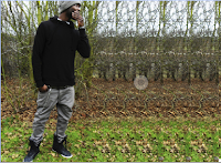
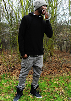
To construct my double page spread I used 'In Design'. Using 'In Design' I realised that the programme gives more contact sheet that 'Photoshop' and its results are more neater, orderly - it easily allows me to change the font and layout of my article. I first set up my double page spread by changing the orientation to horizontal and adding six columns (this is the average length and width of double page spread articles).
 Through my researching of double page spreads, I found the articles which used their image as a background more appealing. However the image which I choose for my double page spread was not long enough moreover through the integration of Photoshop with InDesign, I was able to alter the length of my image. This was done by manipulating the image - using the selection tool I selected the end of the image copied it then pasted it on a new layer. I did this ten times till it looked like this (left side). I then used the blur tool to eliminate the obvious additions of the copied layers. Automatically the new change to image was shown in InDesign. Next I created the box I placed my article, (I made this directly into InDesign rather than Photoshop) using a vector tool and created two rectangular boxes. I made the outer vector baby blue and the inner vector white. Once I had finished making the box for my article, I began on the title of my article - 'EXCLUSIVE IM DA KING'. In making 'EXCLUSIVE IM DA KING' I used the font 'Hollavetica, making 'EXCLUSIVE' the same burgundy that I used on my front cover (to show the consistence of my house style) and made 'IM DA KING' black to contrast with the colour od 'EXCLUSIVE' (making them both stand out). I then added a controversial question 'FOR HOW LONG?' this highlights my artist 'cockiness' as he attempts to answer this question throughout the interview - I made the colour baby blue but changed the font to 'Chewy'.
  Next I added my description of my artist DohDan using the font Arial Bold to either reintroduce or introduce him to my readers. I then copied my article from Microsoft Word into InDesign, into the last two columns of the six that I had created. This automatically gives my article a neat, professional look, I also made the questions burgundy and bold while the answers are in black to differentiate between the two, although I used the same font to not only show consistence but once again professionalism and neatness.
I then used the vector tool and created another rectangular shape near the top of my page. Inside that vector I placed 'B EXCLUSIVE INTERVIEW' - in making these words I used a unique selling point that several successful magazines use, which is turning the name of the magazine into a logo. As mentioned on my blog previous turning the name of a magazine into a logo could make the magazine easier to recognise, nonetheless just the letter 'B' was an idea inspired by Q magazine which signature Q is well-known. Therefore in order to make my magazine well interconnected with readers and professional I used the first letter of the title of my magazine to represent the name 'BUZZIN'. This was simply done by copying the layer 'BUZZIN' into a new document, next I used the section tool (not the crop tool because it would reduce the entire image to the size of what is selected instead of cutting the selected section and leaving the remains of the image) and just like my background image extended the 'B'. The rest of the words (EXCLUSIVE INTERVIEW) I used the colour burgundy and font Arial.

 To add the finishing touches to my magazine I added my page number to the left side of my magazine - using the vector tool creating a square then placed the number 25 (same as mentioned on content page) which was the colour baby blue and font American Purpose. On the bottom right I used the vector tool and created a rectangular tool, inside that rectangular tool I placed the page number, the name of my magazine (BUZZIN), date and the website of my magazine.


No comments:
Post a Comment