
Friday, 27 April 2012
Saturday, 21 April 2012
Rap/R'n'B Artists
Using google I researched on a couple of the successful Rap/R'n'B/HipHop artists to get a good understanding of an Rap/R'n'B/HipHop artist.
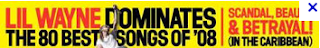
Drake whose full name is 'AUBREY DRAKE GRAHAM' was born on the 24th October 1986. He grew up in Canada and was discovered from a very early age playing the character Jimmy Brooks on a television series - Degrassi: The Next Generation. Around June 2009 the known rapper Lil Wanye signed Drake to his record label (Young Money Entertainment). The following year (June 15) Drake released his 'THANK ME LATER' album and debuted at number one on the Billboard 200, the album has since gone platinum.
Review of two songs from Drake's latest album
We start with ‘Over My Dead Body‘ immediately entering the world of Drake, with soft piano chords cushioned by a steady filtered beat where a female sampled vocal leads the hook. Drake immediately touches on ‘Find Your Love’ model Maliah Michel claiming he thought she was the girl of his dreams, but we know that never worked. Instrumentally ’40′ has provided Drake with a door of honesty and humbleness to spit his verses over, which adds to his meaningful words. This track really delivers to listeners where Drake believes he is now is, telling us a story of his thoughts, from the joy of being taxed six figures to the feeling of ‘killing everybody in the game last year’ the most iconic line being “I think maybe I was numb to it last year, but you know I feel it now more than ever” highlighting the chronic effect of fame and fortune.
‘Shot For Me‘, for the first time we get to see the fruits of Drake’s vocal talent, immediately entering the song with a more high pitched approached, most likely influenced by Abel Tesfaye, better know as ‘The Weeknd’. Drake juxtaposes our views by arrogantly yet softly telling the girls in question ‘Alicia’ and ‘Catya’ that nobody will ever give them what he did. He enforces regret on them, and definitely shows his dominance expressing his bravado by stating that he is ‘the man’ “B***h I’m the man, yeah i said it, I’m the man”. Telling them that he is written all over the girls, and reminding them that they are listening to him because he knows they are going to hear this. The hook relates to Drake demanding they take a ‘shot’ for him, for the simple reason that he’s made it and they let him go. Drake’s retro style singing is a charming and modest approach to express his vocal talent, as he has stated many times that he is not the greatest of singers, however he overpowers the listener with outstanding melodies that will stick in their minds and are likely to be sung or repeated by the individual, music is easier to relate to if one can regurgitate what is being said, and Drake utilizes this in all of his songs. He is just simply a relative artist.
Rick Ross whose full name is 'WILLIAM LEONARD ROBERT' was born on the 28th January 1976. He derived his stage name from a drug trafficker 'Freeway Ricky Ross' (although there are no connections between him and the man). Ross founded his own record label (Maybach Music Group) on which he released his studio albums Deeper than Rap and Teflon Don. In early 2012, MTV named Rick Ross as the 'HOTTEST MC IN THE GAME'
Inside look at Rick Ross latest mixtape
(a few strong words)
(a few strong words)
Location
The locations of my photography for my magazine is an important element in constructing my music magazine. I went to places such as :-

- Kingston university
- Butlins (the lighting was beautiful in this place)
- Wolverhampton
- Charing Cross skate park

Whenever and wherever I went someone where, I always ensured had a camera with me in case across any beautiful scenery. Even if I weren't with one of my models I still took the picture because I could use it as a background.
Target audience
The target audience for my magazine will 16 - 26 year olds who love/interested in Rap and R'n'B music. I choose the age range because from generations to generations the love/interest in R'n'B and Rap music has started to gain the interest of younger years. However this particular age range of my target audience incorporate individuals that are not only interested in Rap/R'n'B music but interested in it to the extent of buying a magazine of its genre. Moreover I believe the age ranging from 16-26 are people interested enough to buy my magazine and may look up to artists such as these:-


Time Management
During the construction of my magazine, time management was very important to me. In order to help with my time management, the construction was split up into five parts which made it easier for me to complete my magazine.
Monday 5th December - Photos for front page, contents and DPS
Friday 14th January - Front Page complete
Friday 27th January - Contents
Friday 3rd February - DPS article draft
February 27th - DPS complete.
Theses deadlines helped me to review whether I was being efficient enough with my time. Although I must admit keeping to some of the deadlines seemed harder than I thought (due to me carelessly losing my USB a couple of times). Also the first deadline out of the all five of them was the most hardest because my model was in university and was in his exams season, moreover it cost me around eighteen pounds, fifty-six to travel from my house to his university. Also because I wanted to make sure all the images I take come out very vibrant and detailed in colour, I used my friend canon camera. However in order to get the camera I had to wait three days as she does a photography course therefore her camera was unavailable to me, and that took up a lot of my time. Altogether the deadline did give a good structure, and contributed very well to my time management.
Flat plan - Front Cover
Before making my magazine in photoshop, I created a flat plan on the computer of what I wanted my front cover to look like.
.jpg) As you can see it is quite basic, this is because I wanted a basic structure which I could play off, be creative.
As you can see it is quite basic, this is because I wanted a basic structure which I could play off, be creative.
Strapline - while researching magazines, the format of Vibe magazine stood out the most to me.
 As you can see their strapline it quite chunky with a bright contrasting background ensuring it stands out. However I would want my strapline to stand out but to the extent of deterring the focus from the image of my artist, therefore I am going to use a black background, using the colour white (contrast beautifully with black), red (bold colour, usually symbolises urgency and it is the colour of my artist hat) and blue (to slightly calm down the remaining colours.
Masthead - I want blue to be the dominate colour on my magazine, therefore I would like my masthead to incorporate the colour blue. I also want it to stand out so I will add a gradient effect on the colour blue to also make it vibrant.
Coverlines - I want my coverline situated around my artist (making my artist centre of focus), I also want my coverlines to be controversial to catch my target audience attention making them want to pick the magazine up. Nonetheless I am going to use the colours red, blue and black, am going boxes to emphasis certain coverlines that I believe my target audience would love to read.
Bar code/Competition - From my research I found all magazine both successful and failing have bar code, so I must include one. However to stop it from taking up space I am going to put in a rectangular box, positioned horizontally. I also want to add a competition into my magazine which many well-known magazine do as a unique selling point. Although I do not want my competition to be as ordinary as text so and so to see if you have won, but to make it more adapted to our modern technology. Moreover from my research I discovered that owners of a blackberry as of:-
2010 - 47,452
2011 - 62,600
2012 - 79,335
It has been predicted 2015 - 122,864
Overall the amount of people owning a blackberry which could scan a bar code has increased and is set to continue to be increasing, so I made up my competition based on that.
Featured Artist Album - I want to add a free giveaway inside of magazine rather on the front as a cover mount because it would take up too much, although to make my readers aware that there is a featured artist album as a free giveaway in my magazine. I will make a small box at the bottom of the magazine using the colours - black, dark red, and grey. I would add a small description of what the album is
.jpg)
Strapline - while researching magazines, the format of Vibe magazine stood out the most to me.
Masthead - I want blue to be the dominate colour on my magazine, therefore I would like my masthead to incorporate the colour blue. I also want it to stand out so I will add a gradient effect on the colour blue to also make it vibrant.
Coverlines - I want my coverline situated around my artist (making my artist centre of focus), I also want my coverlines to be controversial to catch my target audience attention making them want to pick the magazine up. Nonetheless I am going to use the colours red, blue and black, am going boxes to emphasis certain coverlines that I believe my target audience would love to read.
Bar code/Competition - From my research I found all magazine both successful and failing have bar code, so I must include one. However to stop it from taking up space I am going to put in a rectangular box, positioned horizontally. I also want to add a competition into my magazine which many well-known magazine do as a unique selling point. Although I do not want my competition to be as ordinary as text so and so to see if you have won, but to make it more adapted to our modern technology. Moreover from my research I discovered that owners of a blackberry as of:-
2010 - 47,452
2011 - 62,600
2012 - 79,335
It has been predicted 2015 - 122,864
Overall the amount of people owning a blackberry which could scan a bar code has increased and is set to continue to be increasing, so I made up my competition based on that.
Featured Artist Album - I want to add a free giveaway inside of magazine rather on the front as a cover mount because it would take up too much, although to make my readers aware that there is a featured artist album as a free giveaway in my magazine. I will make a small box at the bottom of the magazine using the colours - black, dark red, and grey. I would add a small description of what the album is
Friday, 20 April 2012
Evaluation Question - Five
How did you attract/address your audience?
In order to find out whether my magazine attract/address my audience, I got one female and one, two different personalities as you will see from video to answer this question.
In order to find out whether my magazine attract/address my audience, I got one female and one, two different personalities as you will see from video to answer this question.
Evaluation Question 7
Looking back at your preliminary task (the school magazine task), what do you feel you have learnt in the progression from it to full product?
Suprisely I felt the preliminary task of constructing a school magazine, benefited my well in making my music magazine. The preliminary task has taught me a variety of skillful and benefical techniques, it has also introduced me to a variety of softwares such as Photoshop and InDesign which taught me how to manipulate images and use different tools to put together my music magazine.

If I was to compare my music magazine to my preliminary task, you could clearly that my school magazine lack greatly in professionalism and creativity which I believe my music magazine has. It looks very simple and of a low standard. Although before creating my preliminary task I had the basic understanding of what not to and to include into my school magazine but I seem to not full understand.
- Comparison between front covers
Straightaway when you compare both covers you can see which one could easily sit on the shelf and which one looked like an 'Einstein at Microsoft Word' made it in a Microsoft Word document. There is a lot of space on my school magazine - it has few cover lines and the font along with the colour contrast greatly with the background. Additionally the music magazine looks more vibrant that the school magazine, this could be due to me trying to incorpret the colours from the school bag into my magazine. Although since going back and reviewing over the preliminary task I have found that it is possible to use the same colours (blue, yellow and grey) in a more vibrant way.
- Comparison between content pages
From my research in print production, magazines usually have a three column structure in their content page which ensure them that they are using up as tmuch space as possible at the same time, stopping it looking cluttered as it has a structure. Nonetheless I discovered that leaving a lot of space in your magazine in can cost a lot of money moreover comparing the two content pages I can see that my school magazine not only lacks a lot of professionalism but has a lot of space which may cost a lot in print production.
Furthermore looking back at my preliminary task I feel my knowledge of using Photoshop has expanded. I have learnt where each tool is, how to find it etc. I have also found a webiste filled with over a hundred of fonts (dafonts.com) - this expands my variety of fonts allowing to experiment with more. The most important thing I have learnt is how to make my work look professional and useful techniques in my magazine that I could increase my consumers.
Overall since the preliminary task the complexity of my layout has increased, my kmowledge about softwares have improved throughout the project.
Suprisely I felt the preliminary task of constructing a school magazine, benefited my well in making my music magazine. The preliminary task has taught me a variety of skillful and benefical techniques, it has also introduced me to a variety of softwares such as Photoshop and InDesign which taught me how to manipulate images and use different tools to put together my music magazine.
If I was to compare my music magazine to my preliminary task, you could clearly that my school magazine lack greatly in professionalism and creativity which I believe my music magazine has. It looks very simple and of a low standard. Although before creating my preliminary task I had the basic understanding of what not to and to include into my school magazine but I seem to not full understand.
- Comparison between front covers
Straightaway when you compare both covers you can see which one could easily sit on the shelf and which one looked like an 'Einstein at Microsoft Word' made it in a Microsoft Word document. There is a lot of space on my school magazine - it has few cover lines and the font along with the colour contrast greatly with the background. Additionally the music magazine looks more vibrant that the school magazine, this could be due to me trying to incorpret the colours from the school bag into my magazine. Although since going back and reviewing over the preliminary task I have found that it is possible to use the same colours (blue, yellow and grey) in a more vibrant way.
- Comparison between content pages
From my research in print production, magazines usually have a three column structure in their content page which ensure them that they are using up as tmuch space as possible at the same time, stopping it looking cluttered as it has a structure. Nonetheless I discovered that leaving a lot of space in your magazine in can cost a lot of money moreover comparing the two content pages I can see that my school magazine not only lacks a lot of professionalism but has a lot of space which may cost a lot in print production.
Furthermore looking back at my preliminary task I feel my knowledge of using Photoshop has expanded. I have learnt where each tool is, how to find it etc. I have also found a webiste filled with over a hundred of fonts (dafonts.com) - this expands my variety of fonts allowing to experiment with more. The most important thing I have learnt is how to make my work look professional and useful techniques in my magazine that I could increase my consumers.
Overall since the preliminary task the complexity of my layout has increased, my kmowledge about softwares have improved throughout the project.
Clothing
Once I have chosen my models the next important to do was to sort out their outfits. I was able to figure this out from what I had seen other models/artists where on front covers of R'n'B and Rap magazines - urban style. The urban style has become very popular in particular the trainers in shops such as Footlocker, JD, whereas the clothing has become popular in shops such as Blue Ink etc. However because the theme of my magazine issue is 'identifying the business man behind every successful rapper' I would need to incorporate two types of style, one would be urban and the other smart.
 I believe the best artist/group to get the urban look from is a group called 'NEW BOYZ'. Their style and fashion very vibrant and to me definitely stands out, plus they put a lot of thought and confidence into their style. Using Google I found background information on their style/fashion, here is a short clip on how they describe their type of fashion - 'jerkin'
Loungin with the New Boyz: Jerkin Fashion #3
New Boyz | Myspace Music Videos
In order to get the business look, using Google I researched on the entrepreneur P Diddy whose dress code is all about the elegant, sophisticated look. Here is a short clip that describes his fashion and fashion line. (Watch 1.20 - 4.10).
Overall from all the information I found I would like to dress up my model in a tailored suit and then dress them in the 'jerkers' style incorporating things such as a snap etc. Then find a way to merge the two styles together.
 I believe the best artist/group to get the urban look from is a group called 'NEW BOYZ'. Their style and fashion very vibrant and to me definitely stands out, plus they put a lot of thought and confidence into their style. Using Google I found background information on their style/fashion, here is a short clip on how they describe their type of fashion - 'jerkin'
 Loungin with the New Boyz: Jerkin Fashion #3
New Boyz | Myspace Music Videos
In order to get the business look, using Google I researched on the entrepreneur P Diddy whose dress code is all about the elegant, sophisticated look. Here is a short clip that describes his fashion and fashion line. (Watch 1.20 - 4.10).
Overall from all the information I found I would like to dress up my model in a tailored suit and then dress them in the 'jerkers' style incorporating things such as a snap etc. Then find a way to merge the two styles together.
Planning - Model
In making my magazine I realised that with model I would not only have to think about their look but the financial cost of this model, therefore the type of model I use is extremely important when it comes to making my magazine. Due to the genre of my magazine I need a model that would the fit the urban, R'n'B and Rap look. Moreover I made sure my models were at least 17 and above avoiding any chances of my rapper looking too young. However through researching I found that males in particular tend to look younger than their actual age, this is sometimes as a result of constantly exercising or sport which majority of men do. Nonetheless I contemplated about whether I just use women. Next I cancelled out the people who I felt at first would be unreliable enough to take on the photoshoot - e.g university exams, AS/A2 exams. Then cut down my models to who I felt did not have a mature enough face to give my magazine a realistic look. I then chose the model which I felt was the most versatile to use on my frontpages. This left me with eleven models.
Out of the eleven models I need the one perfect person that would really make my magazine stand out if put on the shelf. In order to help me with my decision took sample pictures of all the models I felt could potentially be on my front cover.
 Through a lot of deliberating I choose my model Daniel to represent my first issue, and as mentioned before is 21 years old, 5ft 10 and a size 8 in clothing - a comfortable age, weight and length of a person for me to work with. Also I believe due to the expenses of university, he was forced to carry the rugged look as its was cheaper for him than constantly cutting your hair, this worked perfectly well for me as I thought he fitted the stereotypical rapper's image perfectly.
Out of the eleven models I need the one perfect person that would really make my magazine stand out if put on the shelf. In order to help me with my decision took sample pictures of all the models I felt could potentially be on my front cover.

Thursday, 19 April 2012
Construction - DPS 2
Due to my interview being so long I had to extend my double page spread to another double page spread. As mentioned previously on my blog I decided to not follow the usually trends of magazine that if the interview is too long it will extend to another A4 page rather double page spread like mine did. Nonetheless I repeated majority of the skills/techniques I used on my first double page spread with my second, like keeping the settings the same (orientation - horizontal, and creating six columns).

 Just like the first double page spread, I started with my background. Similar to first image it was not long enough so I had to extend it. Using the selection tool, selecting the end section of my image and duplicating it until it was long enough for background.
 I first started will off with my quote at the top my article 'THE HIGHER YOU GET THE MORE YOUR FRIENDS BECOME FAKE' - I choose this quote because I believed it stood out the most in my interview and it would definitely draw in the attention of readers, I used the font Impact Label and colour black. Next I went on to create three of the boxes using the vector tool where I will place my remaining interview into, I made the outer rectangular burgundy and the inner rectangular white, this ensures my reader will be able to read my interview clearly as the colour was black and the font was Arial. To highlight the continuation of my article onto the second double page spread I made sure the font and the colour of the font remains the same. I then copied the interview into the last three columns of the six.
 As a bonus feature for my readers I added one of his tracks (wrote down the lyrics that stands out and a small review on what it sounds like. I added all this information into a rectangular vector that I made with the vector tool. I then created another rectangular box which I edited in Photoshop. In Photoshop I changed the colour of the vector to burgundy and then changed the shape using the selection (I continued to cut off each section till it formed a triangle, once again InDesign automatically changed the form of vector through the integration between the two programmes. Due to the clever techniques of InDesign I was able to take off the peak of the triangle, by using clicking on the vector and used the blue line (not the brown line because it would cut the image) to hide the 'pointy' section of the triangle. Using the font American Purpose and the colour white I created the words 'NEW DOHDAN TRACKS'. Under those words I made the words 'THE LOWDOWN' which is in the same font but in the colour black. Feeling in an artistic mood I once again made a vector and edited it in Photoshop, in Photoshop I duplicated the layer till I felt it was long enough, I then flattened the layers which made the vector turn into an image in InDesign. Next I made the words 'HERE"S A TEASER OF WHAT"S TO COME...' in the font Arial and colour white. Finally I used the vector tool and created a skinny long baby blue rectangular box to differentiate between the title of the song and the reviews.
I made 'IM DA KING...SOUND LIKE...STAND OUT LYRICS' all the same font which was America Pupose. The rest of the words I made the font Arial and the colour actual little. Finishing off the article I created the page numbers at the bottom of the page with the exact same format as the first double page spread.

 Just like the first double page spread, I started with my background. Similar to first image it was not long enough so I had to extend it. Using the selection tool, selecting the end section of my image and duplicating it until it was long enough for background.
I made 'IM DA KING...SOUND LIKE...STAND OUT LYRICS' all the same font which was America Pupose. The rest of the words I made the font Arial and the colour actual little. Finishing off the article I created the page numbers at the bottom of the page with the exact same format as the first double page spread.
Construction - DPS 1


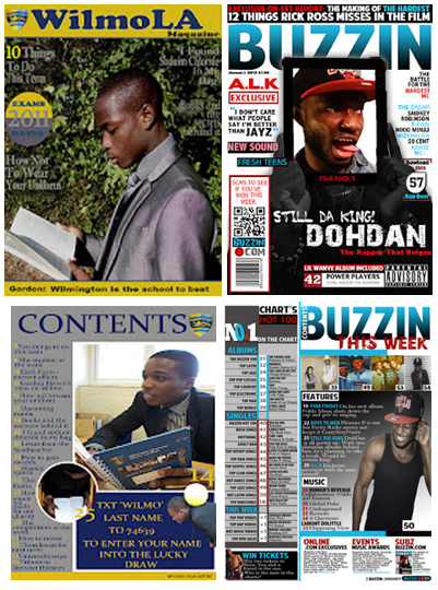
 Through my researching of double page spreads, I found the articles which used their image as a background more appealing. However the image which I choose for my double page spread was not long enough moreover through the integration of Photoshop with InDesign, I was able to alter the length of my image. This was done by manipulating the image - using the selection tool I selected the end of the image copied it then pasted it on a new layer. I did this ten times till it looked like this (left side). I then used the blur tool to eliminate the obvious additions of the copied layers. Automatically the new change to image was shown in InDesign. Next I created the box I placed my article, (I made this directly into InDesign rather than Photoshop) using a vector tool and created two rectangular boxes. I made the outer vector baby blue and the inner vector white. Once I had finished making the box for my article, I began on the title of my article - 'EXCLUSIVE IM DA KING'. In making 'EXCLUSIVE IM DA KING' I used the font 'Hollavetica, making 'EXCLUSIVE' the same burgundy that I used on my front cover (to show the consistence of my house style) and made 'IM DA KING' black to contrast with the colour od 'EXCLUSIVE' (making them both stand out). I then added a controversial question 'FOR HOW LONG?' this highlights my artist 'cockiness' as he attempts to answer this question throughout the interview - I made the colour baby blue but changed the font to 'Chewy'.
  Next I added my description of my artist DohDan using the font Arial Bold to either reintroduce or introduce him to my readers. I then copied my article from Microsoft Word into InDesign, into the last two columns of the six that I had created. This automatically gives my article a neat, professional look, I also made the questions burgundy and bold while the answers are in black to differentiate between the two, although I used the same font to not only show consistence but once again professionalism and neatness.

I then used the vector tool and created another rectangular shape near the top of my page. Inside that vector I placed 'B EXCLUSIVE INTERVIEW' - in making these words I used a unique selling point that several successful magazines use, which is turning the name of the magazine into a logo. As mentioned on my blog previous turning the name of a magazine into a logo could make the magazine easier to recognise, nonetheless just the letter 'B' was an idea inspired by Q magazine which signature Q is well-known. Therefore in order to make my magazine well interconnected with readers and professional I used the first letter of the title of my magazine to represent the name 'BUZZIN'. This was simply done by copying the layer 'BUZZIN' into a new document, next I used the section tool (not the crop tool because it would reduce the entire image to the size of what is selected instead of cutting the selected section and leaving the remains of the image) and just like my background image extended the 'B'. The rest of the words (EXCLUSIVE INTERVIEW) I used the colour burgundy and font Arial.


 To add the finishing touches to my magazine I added my page number to the left side of my magazine - using the vector tool creating a square then placed the number 25 (same as mentioned on content page) which was the colour baby blue and font American Purpose. On the bottom right I used the vector tool and created a rectangular tool, inside that rectangular tool I placed the page number, the name of my magazine (BUZZIN), date and the website of my magazine.
 Sunday, 15 April 2012
Evaluation - Question Six
What have you learnt about technologies from the process of constructing this product
 Throughout the construction of my magazine I have used various technologies which allowed me to be as creative as I wanted to be, technologies such as 'Photoshop' to create my front and content page. Photoshop is a great digital image editing application. I was taught how to use the powerful tools to enhance and edit my pictures - tools such as 'magic wand' which allowed me to not only extract my model from the background but select certain parts of the image which I wanted to alter without changing the whole image. Another great tool which I found on Photoshop was the 'transform tool' this tool I found of great use as I was able to enlarge my image without over stretching the pixels in my image at the same time making my image look neat and proportional. Without Photoshop I would not have been able to edit the images that I imported into 'InDesign' for my double page spread.

 In constructing my double page spread I used both 'InDesign' and 'Photoshop' together as mentioned before to edit my images I need to use Photoshop, as InDesign did not allow me to add effects which Photoshop did. For example the 'magic wand' to select a section of my image and change the colour. Additionally in using InDesign I used the programme Microsoft Word to type up my article. What I enjoyed and learnt about Microsoft Word is that unlike Photoshop and InDesign; Microsoft Word correct both your grammar and spelling automatically which kept me 100% sure that I would have no grammatical mistakes and my readers would be able to understand my article.
(To see more on how I used InDesign and Photoshop, please see Construction)
 Another useful piece of technology that I used was an online website - Blogger, this allowed me to be organised as possible. Blogger is equipped with many tools that keep archive of my work,'labels' which allows readers to easily navigate around my blog along with dates and time of each post which helps to me to reflect on whether I am using my time correctly and what I would need to change.
 Furthermore another important piece of technology that I used was the camera in taking my images. In order for my images to come out clear and vibrant I would need a camera with a large amount of megapixels, moreover I invested in my dear friends Canon 600D camera which has 18 megapixels. As mentioned in a previous post the Cannon 600D camera has fantastic properties, such as a uncompressed format, lens mount, exposure compensation, shutter (min-max), metering and so on.
Here is a wall of less detailed technologies that I used in completing my magazine.
(To see more on how I used InDesign and Photoshop, please see Construction)
 Furthermore another important piece of technology that I used was the camera in taking my images. In order for my images to come out clear and vibrant I would need a camera with a large amount of megapixels, moreover I invested in my dear friends Canon 600D camera which has 18 megapixels. As mentioned in a previous post the Cannon 600D camera has fantastic properties, such as a uncompressed format, lens mount, exposure compensation, shutter (min-max), metering and so on.
 Here is a wall of less detailed technologies that I used in completing my magazine.
Monday, 2 April 2012
Interview - Double Page Spread
Performing under pressure is what DohDan does best.
After spending a few years on the Rap Nation side lines, the time had
finally arrived for him to show the world what all the hype was about.
Would he go the way of past rapper protégés who showed potential but
failed (Lil Wanye)? Or would he deliver an album that matched the quality
of the hip hop mixtape of 2010 – I Da One. In this interview I get the inside and out of DohDan…
Dan
thank you so much for inviting me onto the set of your latest song ‘I’m Da
King’, it’s been a long time, what’s been happening in your world?
You’re welcome chick, and yeah girly my
life seems to be getting more exclusive by the days, to the extent the only
person that seems to get my attention these days, is money ya feel me?
Wow
Dan I am in no surprise that money still rules your world from the last time we
met but what about family, don’t you speak to your parents anymore?
Look my name isn’t Dan no more, Dan was
when I was a child, now I’m, DohDan ya hear me, anyway girl, I have so much
love for my mama you should know that, but as for my family I classify that to
be just my mama no one else. (He flicks
his now chewed up toothpick across the room which swiftly enters the bin) ha
I’m not only the king in the rap game but in the ball game as well ya see that
Moving
on I’ve heard that you have a green book in which you write all your rhymes but
you don’t carry that book around. Why?
When I was young, I would run into the
local store, Londis, and just buy a packet of wine gums and skittles – anything
to get a paper bag. And I’d write the words on the plastic bag and stuff these
ideas into the pocket until I got back. Then I would transfer them into a green
notebook, leaving it a home. As I got further and further away from my home and
green notebook, I had to memorise these rhymes – longer and longer. By the time
I got to the first album, I was 18, I didn’t need a pen or paper – my memory
had been trained just to listen to songs, think of the words and put them to
record.
So
you’ve always wanted to be a rapper?
Precisely
Next
your new album…
Yeah girly
With
the hit single ‘I’m Da King’ there has been a few rumours that artist such as
Kanye West and Wiz Khalifa has slammed the idea of you being the king of rap.
What’s your view on that?
Well in this rap game you get a lot of
haters, that which must be Wiz Khalifa and West. But let me put this to them,
who was the first rapper to win best international rapper…erm me …who got
platinum on ten singles in one album which contained eleven songs…erm ME! So I
have every right to answer to the title of the king of rap.
See many rappers think once you’ve reached
the top the hard work is over, no! The higher you get the more your friends
become fake and people start to hate. People who would not even acknowledge
your presence, let alone talk to you being acting like they have supported you
from day one; look chick I was born a king and the all those haters Wiz, West,
yes I’m talking to you, you can never take my position as the ultimate King of
Pop.
I
see you don’t classify any other rapper to be competition to you?
Girly if I told you the answer to that
question, then I would have more than half of the rappers in the music industry
wanting my obnoxious ass dead.
Having
sold 2 million copies of your last album; with your new album now are you going
to use the same tactics or change your strategy?
Well one of my great tactics that has been
with me and brought great success is change – having a different album each
time is what I believe would attract more people. You must have heard my last
album I had a lot of ballads with the hottest singer in the game, Mary J Blige,
Beyonce, Rihanna, I had it all
So
what can we expect from this album?
Well following my tactics I am hoping to
mix rap and dub step together, giving my album a new favour.
Do
you think this will separate you from other rivals?
Nope, I know! Many rappers reading this
interview may attempt to do the mix that I have just mentioned but I guarantee
you no matter how hard they try it will never be the same because God blessed
with a talent that I believe is rare to get. That why my albums always leave
the shelves empty it has that swag to it, ya feel me?
Well
DohDan I must admit this interview has shown me how exclusive your life is, but
before we draw to a close I just want to know, well I think majority of your
female fans want to know. Is there a woman in your life?
Well beautiful not at this present moment,
but you can tell them girlies that you seem to be catching my eye.
(Shuffling
in my seat, I major to squeeze out awkward laugh) Hmm DohDan I’m sure that
would cause a riot, let’s not. Anyway thank you for your time and once again
thank you for accepting to do an interview with Buzzin magazine.
Construction - Content Page

 |
| FX Tool |
 Using a rectangular vector I made a large grey rectangular. Using the same rectangular vector tool i made the division between the music chart list and the other sections. I once again I used the vector tool and created another box in which I would place the list of articles - I added a (black,white and grey) gradient effect onto the box using the FX tool. Originally the rectangular vectors I used to divide my sectors were a dark red however looking from my front cover to the content page I found that baby blue was the dominate colour moreover in order to make the obvious link between the two I changed the vectors to baby blue.

 Next the main heading to my music chart I used American Purpose and used the three baby blue, white and a dark burgundy and created 'N0.1 on the chart'. In the top right corner I created a small logo for my music chart. The top half I used the rectangular vector tool and created a white box, on top of that I created (text tool) the word 'Chart's' I changed the colour of the apostrophe from black to baby blue. On the bottom half of my logo I used the rectangular vector tool again and created a black box, in the black box I placed the words 'Hot 100' (Font - Condensed Arial, colour - red).
 Further on I made the a competition box. Using the rectangular vector box again I created a black box and placed a outer glow effect with the FX tool. I then took one of my image and with the magic tool outlined my model and extracted it from the image. Next I duplicated the layer and dragged into my content page, with the transform tool I turned the image 89 degrees anticlockwise to create the impression that the model walking out of the box. With the font American Purpose I made the words 'WIN TICKETS' making sure all the letters were in uppercase to grab my reader's attention and made the colour baby blue to fit in with my house style. The description of the competition (underneath the title) I used the font 'Century' and the colour white (to contrast with the black box) informing my reader more about the competition.

 Additionally I imported my masthead from my front cover to my content page in order for it to become more recognisable with my readers, hopefully turning it into a well known logo like 'Q magazine' (the signature Q). To import a file from one another, I had to first duplicate the layer of my masthead and drag it into a new file. From there I saved it as a PNG (flattening the layers together and removing the white background, then imported it. Next I created the words 'Contents' - all letters in uppercase and used the transform tool and rotated the word 180 degrees anticlockwise; shrinking it to size in order for it to fit into the letter 'B' of Buzzin. Underneath Buzzin I created the words 'This Week' - I wanted to show a variety in the fonts I used but not to the extent of making my magazine not look professional moreover I took a front from my front cover that I used probably once or twice (28 Days Later) and made it the font of 'This Week'.
I them took four of my images, using the transform tool and shrank it to fit in the gap I created. On top of the four images I created boxes (vector tool) and placed them in the bottom right corner of my images, on top of the boxes (font - American Purpose) I put numbers that would correspond to the different articles in my magazine.


 Next I started working on my list of article sections which I called 'Features' and 'Music'. Using the rectangular vector again I created two white boxes, in those two white boxes (font - American Purpose) I wrote the words 'Feature' and 'Music'. Underneath the feature section I made the colour of the numbers (font - American Purpose) white, the title of the articles (font - Boris Black Boxx) baby blue and the description of each article (font - Century) white. Underneath the music section I made the colour of the numbers (font - American Purpose) and the title of the articles is black (the first and the second to last article are in font - American Purpose and the rest are in font - Century). To the right-hand side of my content page I placed one of my images in which I used the magic wand tool to extract it from its background then rotated it 89 degrees clockwise to give the impression the model is leaning off my content page, on top of that image I used the vector tool and created a box and placed a number inside to correspond to the article in the magazine (font - American Purpose).
  Finally I completed the bottom section to my content page which I wanted my readers to read in order to get more information about my magazine. I made three paragraphs, the first paragraph contains information about my magazine website - I made the word 'Online' (font - Boris Black Boxx, colour - Red), on a separate layer I created '.Com Exclusives' (font - American Purpose, colour - Black), the rest of paragraph I used the font Century and made the colour black except from the last line which I Incorporated the colour baby blue. Likewise the same for my second paragraph except it was about upcoming music events, and so on the third paragraph except it was about subscribing to my magazine I also imported a PNG image of my front cover and placed it into my third paragraph as a sample of the magazines they will be subscribing to.
 At the bottom of my magazine I placed the page number, name of my magazine, the month of the issue and the website of my magazine. The page number and the name of my magazine (font - Boris Black Boxx), the month of the issue (font - 28 Days Later), the website of my magazine - I used the same format that I used on my front cover for my magazine website (I used the circular vector tool and stretched it to make it look like a rectangle with circular edges and made it black. Next I placed the words 'Buzzin' and 'Com' along with a circlular vector on top of it, the font I used for 'Buzzin' and 'Com' was 28 Days Later.
Subscribe to:
Comments (Atom)