
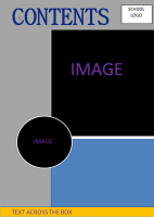
 This is the final design of my preliminary task in which I had to make a school magazine, here is my content page and front cover, I named my magazine WilmoLA as it related to the name of school Wilmington Grammar (the LA was quite random but worked). I designed this magazine in Photoshop. Taking the images were the highlights of making my magazine, thankfully majority of the images I took was able to thoroughly mess around with.
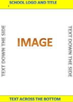 Before I made my magazine, i decided to draw up a plan in order for me to use the time given efficiently. Fortunate for me both my content page and front cover final design was exactly the way I drew my plan. Although for my content page when it came to making it, I altered the colour palette. Making the section that is black white to brighten up the content page because to me it seemed quite dark.
WHAT I HAVE LEARNT FROM MY PRELIMINARY TASK
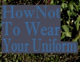
I learnt when making a magazine every detail counts from the camera to the application you use in making your magazine. Taking my pictures i did not adjust the exposure or editing the light so (especially the image featured on my front cover) was difficult to use. It contrasted with the colour text, it made it difficult to position the text. However due to my experiences with Photoshop I was able to adjust the lightning and used the blur tool, to soften the leaves, which came out quite vibrant due to the positioning of my model. I also learnt the importance of the layout, thanks to my image (it having a busy background) I did not really have to add much to the front cover, the image kind of did the job for me, although I was not silly enough to leave it bare.
After seeing the final design of my magazine I realised there are a few improvements, such as the position of my model, from the variety of top magazines I have looked at there is none that I could find with the artist not facing the camera (their were a few odd ones but their body posture were at least facing the camera). Moreover I believe that the position of my model can give off an unwelcoming presents, their is no connect between the reader and the front page. I also found that if I would have taken time and fully concentrated on my content page, I would have edited the images much better, for example the top right image looks a bit over stretched therefore I should have taken the original size of the image, used the transform tool to adjust it - even if that image is over stretched, the transform tool adjusts the image so that it does not look like a blur.
BACKGROUND|IMAGE
- I decided to stay with the original background of my image rather than to create my own because when planning my magazine I came up with the idea that school magazines should have a warm environmental aspect to it. However like I mentioned before the colour of the leaves were too vibrant which caused many problems - positioning of the text.
FONT (COLOUR|COVER LINES)
- I wanted the font to relate the status of the school, it being a grammar I decided to go for the 'posh-looking' text. The font that I used was 'Imprint MT Shadow'. However once I picked the font I was faced with many problems which almost drove me to the extent of changing my image which would have meant I did not stick to my plan.
 - The initial colour of the text was blue, however it contrasted greatly with the vibrant leaves, I tried many methods to make the blue text work such as blocking the words with a grey box, but I felt it made my magazine look tacky. The thing I decided to consider next was whether it was just the colour of the text that did not fit well. I changed the colour of the text to a very light grey (almost a 'sandy' colour).
 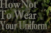 - The grey still contrasted with the vibrant leaves; the final method I used which fortunately worked was to select the section behind the word and darken the lighting. Then slightly blur the edges around the selection bit to blur in the background with the darken section.
- I can up with my cover lines with the intention of my school magazine not only being educational but interesting. Moreover I made sure all my cover lines were equally balanced between educational stories and bazaar stories.
HOW I FIXED THE ISSUE OF CONTRASTING COLOURS
-This is how I fixed my issue of the background contrasting with the colour of my text.

- I Hide the text clicking on the eye in the layer box.

2. I then select the section with the select box (which is
situated in the tool box).

3. Next I went to images, adjustments
then to hue/saturation then played
with the saturation till I was satisfied
with the lighting.
However I had the issue of the section which I have altered not blending in with the rest of the image, so :-

the 'finger' icon in order for the smaller box to appear so I
could click on the blur tool and use. Moreover I use the blur
and the smudge tool to even out the edges of the darken area.
The blur tool (if used for too long on the same area) created
grey areas in which I removed using the smudge tool.
No comments:
Post a Comment