Saturday, 31 December 2011

Top Twenty Gadgets 2011

Trying to adapt my magazine to modern technology, can be quite tricky because I am aware that using too many gadgets in my magazine could have my readers mistake my Hip Hop and Rap magazine for a IT magazine. Moreover I need to research and find out what are the best selling gadgets of 2011. Nonetheless using google I came up with the 'Top Ten Gadgets 2011'


  1. Ipad 2
  2. XBox Kinect
  3. Macbook Air
  4. HP/Palm TouchPad
  5. Amazon Kindle 3
  6. Motorola Atrix 4G
  7. Blackberry Playbook 
  8. Motorola Xoom
  9. HP/Palm Pre 3
  10. Samsung Focus 
From this list I picked out the gadgets that could:-
  • Easily be available
  • Easily fit in with the genre of my magazine 
  • Not deter the focus from my artist
This resulted in me picking:-
  • Ipad 2
  • Blackberry Playbook
  • Macbook Air
Next I research on the statistics of the products; how much have been sold so far in 2011, how much do you think they will sell in 2012? ....According to Wikipedia:-
  • Ipad - More than 15.4 Million Ipads have been sold, selling more than all other tablet PCs combined - Apple sold 300,00 Ipads on the day they first became available. This all generated to 9.5 billion dollars (6.1 billion pounds) in revenue and captured more than 90% market share in the tablet computer segment. By 2012 Apple would have released 'The new Ipad'. 
  • Blackberry Playbook - It has been estimated that there are 504,000 Playbooks have been sold to date. 
  • Macbook Air - In January Apple reported to have sold 2.9 million Macs. 
From all the information I had gathered, it was clear to me that an Ipad would be the best electronic gadget to use in my magazine. 

Friday, 30 December 2011

School Magazine

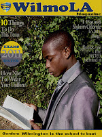
This is the final design of my preliminary task in which I had to make a school magazine, here is my content page and front cover, I named my magazine WilmoLA as it related to the name of school Wilmington Grammar (the LA was quite random but worked). I designed this magazine in Photoshop. Taking the images were the highlights of making my magazine, thankfully majority of the images I took was able to thoroughly mess around with.
Before I made my magazine, i decided to draw up a plan in order for me to use the time given efficiently. Fortunate for me both my content page and front cover final design was exactly the way I drew my plan. Although for my content page when it came to making it, I altered the colour palette. Making the section that is black white to brighten up the content page because to me it seemed quite dark. 

WHAT I HAVE LEARNT FROM MY PRELIMINARY TASK

I learnt when making a magazine every detail counts from the camera to the application you use in making your magazine. Taking my pictures i did not adjust the exposure or editing the light so (especially the image featured on my front cover) was difficult to use. It contrasted with the colour text, it made it difficult to position the text. However due to my experiences with Photoshop I was able to adjust the lightning and used the blur tool, to soften the leaves, which came out quite vibrant due to the positioning of my model. I also learnt the importance of the layout, thanks to my image (it having a busy background) I did not really have to add much to the front cover, the image kind of did the job for me, although I was not silly enough to leave it bare. 

After seeing the final design of my magazine I realised there are a few improvements, such as the position of my model, from the variety of top magazines I have looked at there is none that I could find with the artist not facing the camera (their were a few odd ones but their body posture were at least facing the camera). Moreover I believe that the position of my model can give off an unwelcoming presents, their is no connect between the reader and the front page. I also found that if I would have taken time and fully concentrated on my content page, I would have edited the images much better, for example the top right image looks a bit over stretched therefore I should have taken the original size of the image, used the transform tool to adjust it - even if that image is over stretched, the transform tool adjusts the image so that it does not look like a blur.

BACKGROUND|IMAGE  

- I decided to stay with the original background of my image rather than to create my own because when planning my magazine I came up with the idea that school magazines should have a warm environmental aspect to it. However like I mentioned before the colour of the leaves were too vibrant which caused many problems - positioning of the text.  

FONT (COLOUR|COVER LINES)

- I wanted the font to relate the status of the school, it being a grammar I decided to go for the 'posh-looking' text. The font that I used was 'Imprint MT Shadow'. However once I picked the font I was faced with many problems which almost drove me to the extent of changing my image which would have meant I did not stick to my plan.
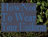
- The initial colour of the text was blue, however it contrasted greatly with the vibrant leaves, I tried many methods to make the blue text work such as blocking the words with a grey box, but I felt it made my magazine look tacky. The thing I decided to consider next was whether it was just the colour of the text that did not fit well. I changed the colour of the text to a very light grey (almost a 'sandy' colour). 
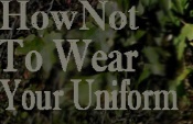
- The grey still contrasted with the vibrant leaves; the final method I used which fortunately worked was to select the section behind the word and darken the lighting. Then slightly blur the edges around the selection bit to blur in the background with the darken section. 
- I can up with my cover lines with the intention of my school magazine not only being educational but interesting. Moreover I made sure all my cover lines were equally balanced between educational stories and bazaar stories.  

HOW I FIXED THE ISSUE OF CONTRASTING COLOURS 

-This is how I fixed my issue of the background contrasting with the colour of my text.
  1. I Hide the text clicking on the eye in the layer box.


     2. I then select the section with the select box (which is 
        situated in the tool box). 


    3. Next I went to images, adjustments
       then to hue/saturation then played
       with the saturation till I was satisfied
       with the lighting.


However I had the issue of the section which I have altered not blending in with the rest of the image, so :-

      4. I used the blur too (situated in the tool box - I had to click on
        the 'finger' icon in order for the smaller box to appear so I
        could click on the blur tool and use. Moreover I use the blur
        and the smudge tool to even out the edges of the darken area.
        The blur tool (if used for too long on the same area) created
        grey areas in which I removed using the smudge tool.

Ideas For My Magazine

 The genre of my magazine is HIPHOP|R'N'B. The format in which i am guiding my magazine is Vibe magazine. I chose this magazine because even though it may not be the biggest selling magazine of our time, (I am clearly aware of the financial issue with Vibe) I still believe that their magazine structure is very appealing; the controversy they write about (to me) highlights the independence of the magazine - they're not afraid to speak their mind. 

 I made a questionnaire (but no ordinary questionnaire) to make it fun and active i created a questionnaire using a Microsoft Word in which i typed up a list of possible names of different papers for my magazine. I then went round to different individuals and told them to hold up the name they believed sounded suitable for my music magazine. From my research I found that BUZZIN (76%) was the most preferred name (FUSE - 20%|MUZIK - 5%).

Wednesday, 21 December 2011

Magazine Analysis - Kerrang! Magazine


FOUNDERS|PRODUCER
OF KERRANG!...
Kerrang! magazine was foundered by GEOFF BARTON, it is a UK-based magazine all about rock music, it is published by Bauer Media Group (same company that publishes Q magazine). 


COST|AMOUNT OF TIMES IT IS PUBLISHED...
Unlike Vibe and Q magazine, Kerrang! is published weekly and was first published on JUNE 6TH 1981, (way before I was even thought about, it still stands as a top competitive magazine). It now cost £2.20 for one magazine.


TARGET AUDIENCE...
The target audience was 16-25 year-olds (particularly rock music fans). Although over a period time the age of the target audience dropped to 14-17 year-olds (teens who tend to buy the magazines due to the featured bands on the front cover portrayed to much 'cooler'. Additionally the older years began to see Kerrang! in a different light, some saw their obsessed with rock music and being an emo as a faze and grew out of it. According to a website called journalism - 'complaints were received about Kerrang!'s sudden emphasis on emo and metal core music. The magazine continually printed issues with My Chemical Romance on the front cover several weeks, following the release of their album (The Black Parade) causing a slight alternation in readership figures'.


SELLING POINT...
A selling point of Kerrang! is the format of which they present they magazines. Their format aims to appeal to both genders, the hard rock and the metal ionic male bands on the front cover pulling angry faces or violent expressions appeal to the male audience, while the use of male bands on free pull out poster appeals to the female audience. Another point is that they involve their readers into their magazines, THE PAGES OF LETTER|DRAWINGS AND PHOTOS|COMPETITIONS etc all gives the readers the opportunity to respond and share their own opinions. Also Kerrang! gives away £50 worth of music vouchers for the letter of the week - this kind of interactions makes the audience feel not only involved (with the publication) but like feels like they are being sold more for a cheap price. Additionally because Kerrang! has other factors to it except from being a music magazine, it is also a RADIO STATION and TELEVISION CHANNEL, Bauer Media Group are able to promote Kerrang! through both TV and radio station which maximises their sales. 


KERRANG!'S CIRCULATION...
The circulation for Kerrang! magazine is 43,033

THE COVER...


THE CONTENT PAGE...

The content page of Kerrang! has a variety of images, to draw the target audience in, The dominance of the images are clearly shown along with the advertising information shown throughout the magazine. The images featured are images that they believe would be of interest to the target audience - well known bands such as Time Low .
The word CONTENT stands out on the page as it should, the SANS SERIF font and vibrant colour YELLOW contrast greatly with black background. Below the content page their you have the information of what issue number it is, and the cover date, the reduction in the size of text shows that it is not that important in regards to the advertisement of the content page.
The words 'KERRANG! THIS WEEK' is the same size as the word 'CONTENT', showing the equality in advertisement, at the same time underlining that Kerrang! is published weekly. Also in order to make the title Kerrang! be significant in the content page, they changed the colour to white (which contrasts greatly with the black background) - it is to remind the reader what magazine they are reading. The colour palette BLACK|WHITE|YELLOW is used continuously throughout the magazine (the majority of Kerrang! magazines have this colour palette) moreover this identifies it as Kerrang!. 
The main image featured is of a well-known multi-talented man called ROB ZOMBIE, he is known for his film directing|producing, being a screen writer and musician. ZOMBIE being known in the media-industry makes him relevant to the magazine, as he links with many of the topics the target audience would enjoy reading. The image's mis en scene shows the effect of the image being de-saturated. Even though the image is in an black and white tone it still captivates your attention. You can tell from the facial expression, as he looks down at his guitar, his passion and love for music. However there is no direct connection between the subject and the reader, this is not needed as the intensity in the subject facial expression makes up for that, and draws the audience in. Another way it draws the target audience in is because it juxtaposes with the white background. The dominance of the image is still shown even though their is two images overlapping it. 
On the bottom right of the magazine there is a editors column white a close-up shot of the editor's face, which engages the reader. The editor's column is informal and quite personal - her signature signed at the end of the column implies to the reader that written by her and her only, additionally it tells the reader that her name is NICHOLA it includes her opinion on how she edited the magazine, the interviews she had with the featured artists|bands along recognition of people who made the magazine work. Her facial expression is subtle and welcoming. Having the editor's column is very important because it gives the target audience an insight on the people working behind the scenes of Kerrang!. 
The rest of the content page is made up by the main article and the featured articles. All features have been organised in order by number. The highlighted words neatens up the magazine, as it shows structure and helps the reader to identify the different sections. All the bands displayed in the magazine is highlighted in the content page, for the readers to see it straightaway without having to read through the whole content page. Also all the bands listed are well-known bands moreover the more known bands are featured the more reader would be willing to purchase. For it shows the popularity of Kerrang! and their variety in bands. 
Also in the centre of magazine there is a blink 182 poster, advertising tickets to a concert. This encourages the reader to purchase the magazine, for they would have hope of winning the tickets. Below this is a list of known bands|artists, connoting to reader, as the images are of importance to them. Direct addressing is used in the GOOD CHARLOTTE image as positive facial expressions and welcoming, happy hand gestures. Also Kerrang! uses black stars to help the reader easier identify the article the want to read. Additionally just like majority magazine there is a subscription box which increase sales. 
In my opinion I think the Kerrang! content page is vibrant attractive, many might see it as a successful page which I must agree with. The combination of promotional gifts and a variety of images really makes the page interesting. 

AMOUNT OF PAGES|ADVERTS.
..
In this issue of Kerrang! magazine their are 64 pages, out of that 47 are adverts, this showing that adverts take up majority of the magazine. These are two of the biggest adverts found on the inside cover and the last page of the magazine. Both adverts advertise music, the 'KIDS IN GLASS HOUSES DIRT' advert is and advert which is promoting the release of a new upcoming album called Dirt by a band called Kids in Glass Houses. The other advertisement is from a website called play.com and it is about a sale that they are having on their products. Their products range from CDs|GAMES|GAME CONSOLES to CLOTHING. The adverts take up one whole page which is quite expensive to publish but the cost is made up from the company wanting to advertise in Kerrang!. 
Also in the magazine there were adverts from HMV, PETA and CHILDLINE, these are all adverts which relate to the target audience. For example the HMV adverts is for readers wanting to buy CDs from featured bands in the magazine, the PETA advert is about animal rights and it promotes musicians which support their - e.g. Tommy Lee of Motley Crue. The Childline adverts being advertised in Kerrang! is a brilliant idea, because large proportion of teens read Kerrang! magazines moreover it  being advertised in Kerrang brings about more awareness. Additionally PS3 games their adverts which appeals mostly to the male target audience. Their are also GIGS adverts such as GREEN DAY|BOYS LIKE GIRLS|READING & LEEDS FESTIVAL|YOU ME AT SIX and online ROCK CLOTHING SHOPS adverts such as GRINDSTORE.COM|LOUDCLOTHING.COM



Sunday, 18 December 2011

Magazine Analysis - Q Magazine

PRODUCERS|FOUNDERS OF Q MAGAZINE...

      Q Magazine is an English magazine foundered by  MARK ELLEN and DAVID HEPWORTH and published by BAUER MEDIA GROUP.


    TARGET AUDIENCE...

The target audience is the older generation such as people in their 30s-40s, who are looking for a different mode of address, more sophisticated; people who are generally just interested in music itself. However even though the main target audience is the older generation, it seems that Q magazine does not appeal much to females of the older generation.
- ACCORDING TO PUBLISHERS - http://www.bauermedia.co.uk
 Q's audience is composed of passionate, engaged and open minded music fans driven to continually discover new music - and to use this lust for discovert to influence their friends. The audience is split 75% Male to 25% female and is affluent (with 68% ABC 1)

COST|AMOUNT OF TIMES PUBLISHED...

The price of a Q magazine costs £3.99 and issues are published monthly (which in 1986 made Q magazine stand out from the rest, for technology was not that advanced, so publishing monthly would have been very expensive).


CIRCULATION...


According to WIKEPEDIA Q magazine has a circulation of 80,418


SELLING POINT...


A selling point about Q magazine is that their magazines have a high quality glossy paper moreover this makes the readers feel like they are buying a magazine worth the price. Additionally even though Q is a music magazine they also look at other performing arts; their is a section in Q that has reviews on new releases in MUSIC|RADIO| TELEVISION|FILM|LIVE|CONCERTS. Also they often give away promotional gifts such as CDS|BOOKS which does not only draw in more costumers but it also helps the producers of items - gives them a quick review on whether the product would make enough money once released.

THE COVER...


ACCORDING TO Q MAGAZINE - Why they beat their rivals...
 - They believe they're  'The UK's biggest selling monthly music magazine, Q is the arbiter of quality music. The magazine sits at the heart of a cross-platform brand that discovers great music of substance for its consumers. The Q brand has developed a worldwide reputation as a trusted and premium quality voice of musical authority amongst fans, musicians and the music industry alike - one that is founded upon Q's unrivalled access, world-beating exclusives and outstanding production values. This reputation is extended not only through the magazine but also across online, radio, TV and on into Q's unique events, which encompass exclusive, intimate live shows with major stars and the world famous annual Q Awards.'
- They also have platforms which gives them more profits
    - Q Magazine
    - Q Radio
    - Website (ww.qthemusic.com)
    - Q TV - Sky 304, Virgin Media 338
    - Q Awards
    - Pages on FACEBOOK and TWITTER 


CONTENT PAGE...

Q's content page is simplistic, which keeps to the conventions of the house style of Q - the formal black font, the red boxes with the white numbers. It is a very mature format, the simple black outline around the pictures and information highlights the target audience, portraying them to be mature individuals and elaborate fonts is not a necessity when trying to draw them in. People who would appreciate the professional approach.
    The content page is spread across two pages however there is an additionally page titled Masthead, which is just information about the staff along with the editor-in-chief's note. The first page is the features, then the second page is the regular articles; laid simple following the same structure/house style as the first page. The pictures shown are images with number for the corresponding pages of the artists/bands that are featured in the magazine, therefore the reader can easily find the particular article they want to read, without having to go through the entire magazine. A strong aroma is given off from the various images of the artists/bands. For example the image of Florence from Florence and the Machines, her cheek bones look very define, she has a very determined facial expression, with her arms wrapped around giving the implication she is in her own world, which she controls. The shiny gold material Florence is wearing could represent the progression of her career by looking futurastic; the idea of developed technology. It could also label her as a fashionata. The other images are screenshots of artists/bands who have a featured article in the magazine, this ensures the reader would recognise the articles while going through the magazine.

     Using their USP (unique seling point) there is a quick description under each listed artist/band which effectively sums up what each article is about. However the various images shown are not listed in the content page and does not have a quick description, which is effective because by just showing the images it allows the reader to image what the article will be about; grabbing their attention. For eample the image of Jessie J (second page), her posture shows confidence, she is holding a Q award in her hand, which could sugguest that the article which she is featured in is about her achievements.


 AMOUNT OF PAGES|ADVERTS...

There are 166 pages in a Q Magazine, in which 40 pages in the magazines are advertisements and 126 pages are editorial pages produced by Q itself. Breaking that up even more makes 64 of those pages to be editorial images and 62 to be editorial copies. From my research  I found out that in a Q magazine normally 44 of their images are original and115 images from photo libraries.


CATEGORIES OF PRODUCTS ADVERTISED...


Inside a Q magazine I have come up with five categories... - Music Events - Technology - Alcohol - Albums - Fragrances


,m
- 212 VIP perfume

MAIN MAGAZINE ADVERTS
- Release of Amy Winehouse album
- Braun (sponsored by Argos)
- Speakers (2)
- Black Keys adverts
- HMV advert
- Gig advertisement (18)
- FHM calender
- Albums
- Alcohol
- Q Promotion of blackberry messenger
- Q Next week edition
- Q Radio

BACK COVER ADVERTS
- HTC adverts
- Noel Gallaghers tour

All this advertisements underlines the target audience for Q magazine, along with what products they would like to purchase. It also shows the variety of a Q magazine, as you would expect to see adverts surrounding the genre of rock but you see adverts from ARGOS|BRITISH ALCOHOL, which emphasises the fact that Q is a British magazine.


Wednesday, 19 October 2011

Preliminary Task Planning

Using bubbl.us I created a preliminary task plan, this was a way for me to organise my ideas for my magazine, forming a kind of image of how I want my content page and front page to look like.

Brief

Preliminary Excercise: Using DTP and an image manipulation program, produce the front page of a new school/college magazine, featuring a photograph of a student in a medium close-up plus some appropriately laid-out text and a masthead. Additionally you must produce a mock-up of the layout of the content page to demonstrate your grasp of DTP.
Main Task: The front page, contents and double page spread of a new music magazine (if done as a group task, each member of the group to produce an individual edition of the magazine, following the same house style).